A Deep Dive into Data Visualization and Python’s Popularity

Understanding Data Visualization
Data visualization refers to the graphical representation of data and information. By transforming raw data into visual formats—such as charts, graphs, and maps—data visualization enables individuals and organizations to:
- Simplify Complexity: Large datasets can be overwhelming. Visualizations break down complex information into digestible formats, revealing patterns and trends.
- Uncover Insights: Visual tools can highlight insights that may not be immediately obvious in tabular data, facilitating deeper analysis.
- Communicate Effectively: A well-designed visualization can convey complex messages clearly, making it easier for stakeholders to grasp critical information.
Common Types of Data Visualizations
- Bar Charts: Ideal for comparing quantities across categories.
- Line Graphs: Effective for illustrating trends over time.
- Pie Charts: Useful for showing proportions within a whole.
- Scatter Plots: Excellent for displaying relationships between variables.
- Heatmaps: Helpful for visualizing data density and patterns in two dimensions.
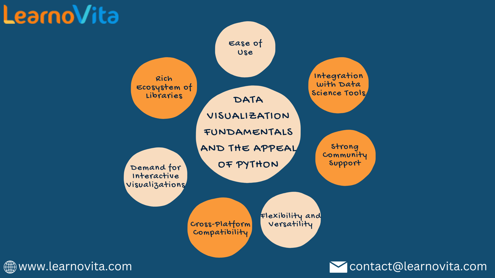
Why Python is Gaining Popularity in Data Visualization
Python has emerged as a leading language for data visualization due to several compelling reasons:
1. Extensive Library Ecosystem
Python offers a rich set of libraries tailored for various visualization needs:
- Matplotlib: The foundational library for static, animated, and interactive visualizations.
- Seaborn: Built on Matplotlib, Seaborn simplifies the creation of attractive statistical graphics.
- Plotly: Focused on interactive visualizations, ideal for web applications and dashboards.
- Bokeh: Designed for creating interactive visualizations that function seamlessly in web browsers.
These libraries provide users with diverse options, making it easy to create a wide array of visualizations.
2. Intuitive Syntax
Python is renowned for its clear and readable syntax, making it accessible for both beginners and experienced developers. Users can create complex visualizations with minimal code, allowing them to focus on data analysis rather than getting bogged down in programming intricacies.
3. Seamless Integration with Data Processing Libraries
4. Versatility Across Domains
Python is not just a data visualization tool; it is a versatile programming language used in various fields, including web development, machine learning, and automation. This breadth of application allows data professionals to utilize Python for multiple aspects of their work, reducing the need for different tools.
5. Strong Community and Resources
The Python community is vast and active, providing a wealth of resources, tutorials, and documentation. This support is invaluable for users of all skill levels, making it easier to find help and stay updated on best practices and new features.
6. Cross-Platform Compatibility
Python's cross-platform nature ensures that visualizations can be created and shared across different operating systems, including Windows, macOS, and Linux. This compatibility facilitates collaboration among teams, regardless of their working environment.
7. Demand for Interactive Visualizations
With the increasing demand for dynamic and interactive visualizations, Python’s libraries like Plotly and Bokeh provide the tools necessary to create engaging user experiences. Features such as zooming, filtering, and hover effects enhance user interaction and understanding.
Conclusion
Data visualization is a critical skill for interpreting and communicating insights from data. Python's extensive library ecosystem, intuitive syntax, and strong community support make it the preferred choice for this purpose. Whether you are a beginner or an experienced data scientist, Python equips you with the tools to transform complex data into clear, actionable insights, ultimately driving better decision-making and fostering a data-driven culture.


Comments
Post a Comment